I was recently sat a petrol station when this poster caught my eye. But it wasn’t the ‘Come on England’ strapline that got my attention. It was the ‘new’ or ‘old’ should we say, Co-op clover leaf logo.
A little excited by this, I thought ‘is it making a come back?’ Hmmmm? So I did a little research and learnt that it actually was making a come back in its 1968 form.
Having worked in-house for Midlands Co-operative for a very long time, I was very much involved with the re-brand of over 200 retail Co-op stores. They bravely chose to ditch the clover leaf device in 2005 in favour of ‘The Co-operative’ brand, and Midlands Co-op proceeded to rebrand all their outlets in 2009. During that time I remember there being very mixed views on whether the new look was the way forward - some murmurs heard at head office were along the lines of it’ll be the death of the Co-op, and will destroy all its heritage.
Needless to say it went ahead. We adopted the new brand, and spent the next three years rebranding the stores. A big project to revert back to after only three years?
I was always a big fan of the clover logo and was very dubious about changing it. It’s a timeless, clever little device, that very iconic of the Co-op and it’s history. Bringing it back clearly demonstrates how ingeniously timeless it actually is. It stands strong, confident and hints at a shift back to the ideas that made the Co-op special for its customers. I think the older generation will feel nostalgic while the younger generation will see the retro logo with fresh welcoming eyes.
I did however think that ‘The Co-operative’ brand did its job, by completely modernising its somewhat dated stores and bringing them into the 21st century with a controversial bang! The Co-op was always seen as a place where older generation shopped, so a steer to entice the younger generation to start shopping there without feeling fuddy duddy worked.
Now it has captured all audiences, and reverted back to its roots. WIN WIN!
Return to blogMore from the blog
 16th June 2026
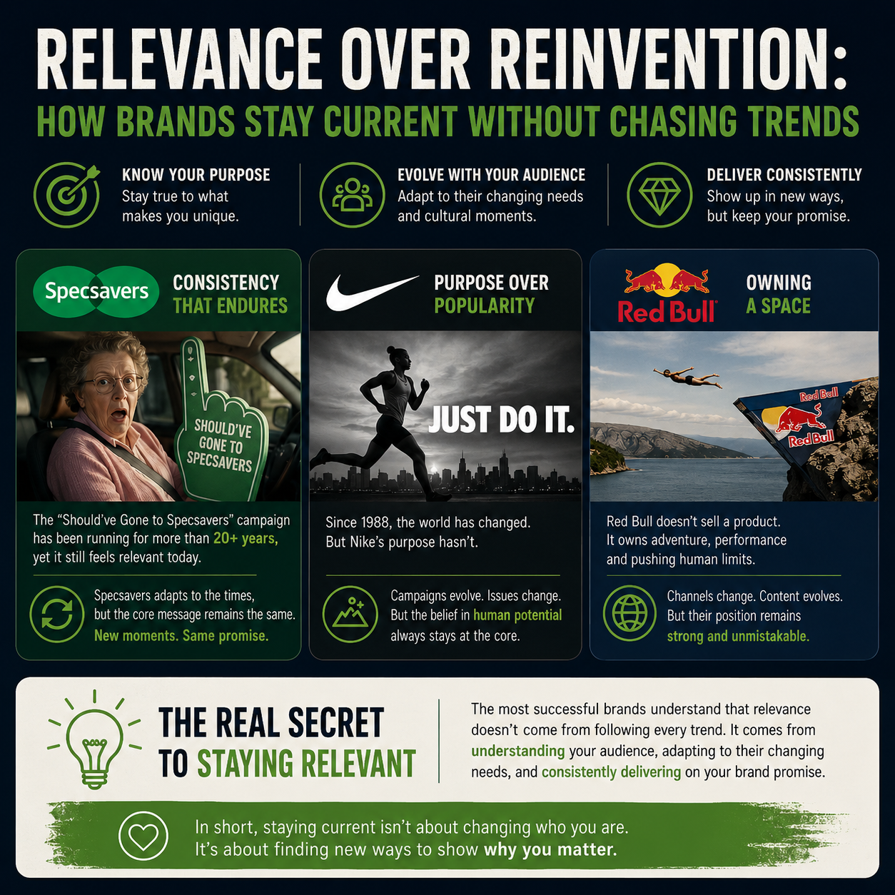
Relevance Over Reinvention: How Brands Stay Current Without Chasing Trends
 21st May 2026
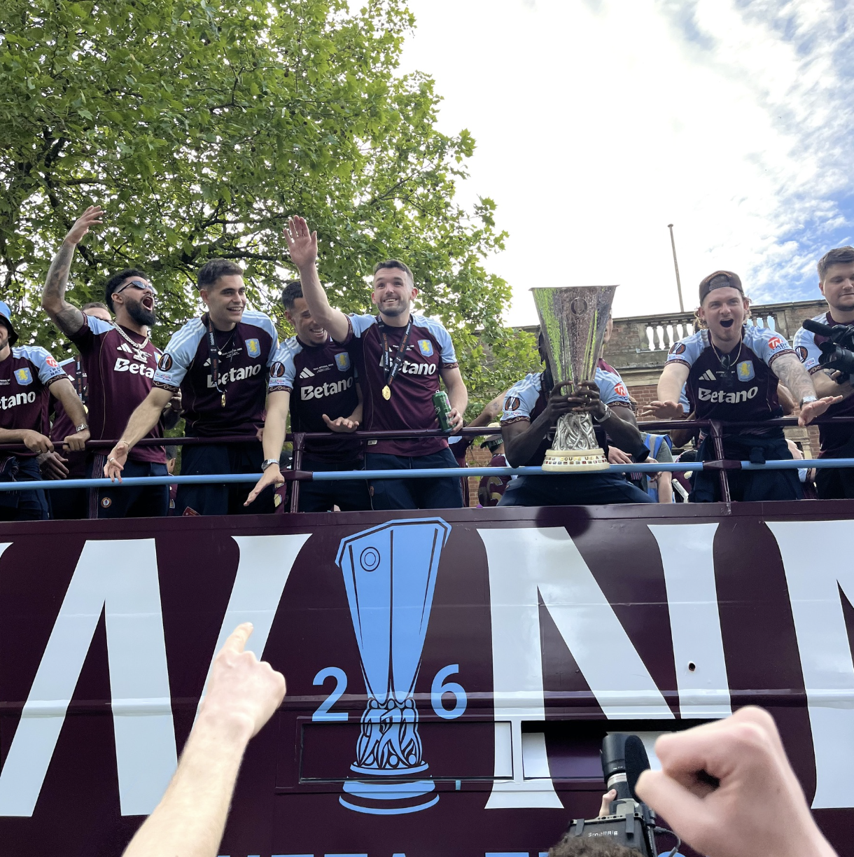
Birmingham Comes Alive for Villa’s Historic Europa League Victory
 20th April 2026
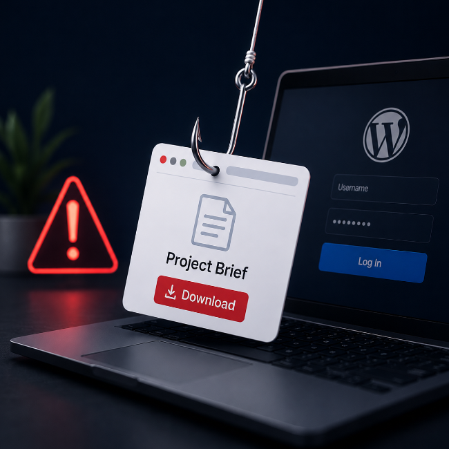
We’re Seeing a New Type of Phishing Enquiry Targeting WordPress Sites
 30th March 2026