Bourne Fields is Cameron Homes’ most prestigious development to date, with 14 exceptional flagship homes in a desirable location between Aldridge and Streetly.
When Cameron first tasked us with creating a brand for Bourne Fields, it was clear that this collection called for a different approach. It required a luxurious, individual identity that would appeal to a stylish and affluent target audience, yet remain true to the well-established and respected Cameron brand.
Using an elaborate typeface for the B and F in Bourne Fields, we created an elegant icon that would be used across all collateral, teamed with aspirational copy beginning with those two all-important initials.
With homes of this calibre, the Bourne Fields brochure needed to be something special. We spoke to specially selected printers with a proven record for producing high-end brochures, before creating several mock-ups to test different spines, stocks and finishes.
The brochure was crafted to mirror the care put into designing and building each home, with foil blocking, sub section tracing sheets and a luxurious uncoated stock. Following a rigorous onsite press pass to ensure every detail was perfect, the Bourne Fields brochure was ready to go out into the world.
To find out more about Bourne Fields or to request one of the beautiful brochures, visit the Cameron Homes website.
Return to blogMore from the blog
 16th June 2026
Relevance Over Reinvention: How Brands Stay Current Without Chasing Trends
 21st May 2026
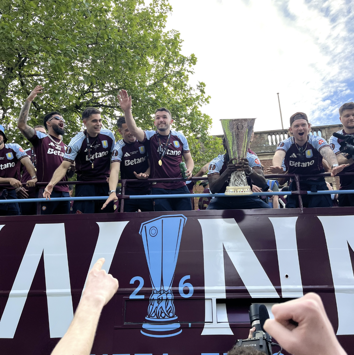
Birmingham Comes Alive for Villa’s Historic Europa League Victory
 20th April 2026
We’re Seeing a New Type of Phishing Enquiry Targeting WordPress Sites
 30th March 2026