For the last year, myself and Senior Creative Matt have been using Bootstrap 4 for our frontend development. It is one of the most popular frontend frameworks, as you can build responsive websites more efficiently and effectively. There are a fair few changes from the previous version to Bootstrap 4 which we have had to get our head around; here is what we found.
Sass
The new version of Bootstrap uses SASS rather than using LESS as Bootstrap 3 did. SASS and LESS are both CSS pre-processors - a program that lets you extend CSS with aspects such as variables, operators and mixins, among other things. This allows you to reduce the amount of code you write in a project. The way the code is written using nested media queries also allows for cleaner code that is easier to understand and interpret.
Different breakpoints for the grids
When building the frontend of a responsive website using bootstrap, there is a grid system we stick to, to make sure different elements work in the different viewpoints. In Bootstrap 3, there are 4 viewpoints, (col-xs-*, col-sm-*, col-md-*, col-lg-*).
Bootstrap 4 gives you a bit more control over these viewpoints by adding one for extra large screens, and removing the extra small class from the lowest break point. This means the class .col-* covers all devices, with no need to specify the size if you don’t need to. With responsiveness being so key to website development now, this is a great addition, and ensures we adapt our websites to respond effectively and efficiently to all modern browsers and screen sizes.
Font size updated to REMs rather than px
Bootstrap have changed from using px in BS3 to using REM in BS4. This is due to its flexibility compared to pixels. It allows you to scale fonts up or down without the size staying fixed, making the design easier to adjust to different screen sizes.
Flexbox and cards
The introduction of Flex is a big thing in BS4. It allows you to manage the layout, the alignment of flex objects, the direction of the objects, the order of flex objects, auto margins, as well as many other elements. It also works responsively which can be useful when you want to add a flex class to an element on a certain screen size. It allows you to be a bit more flexible with your designs without having to use float or absolute positioning.
Bootstrap 4 utilities
In BS4, there have been many additions and changes to the utility classes. These classes are there to allow for quick and easy arrangement of different elements. For example, rather than adding a separate file for little helper classes such as margins or paddings, I can now add a Bootstrap class to the element which will add the padding or margin. There are many more Bootstrap utility classes such as adding borders onto a single side of an element, or floating an element left or right, and with them being fully responsive, you can target these to different screen sizes.
There have been a fair few changes for Matt and me to get our heads around, especially with flex, but now we have, it has made the frontend build of a project a lot more creative, dynamic and efficient. The new features and options that have been added to Bootstrap 4 allow our designs to be more flexible and keep them relevant, without worrying how they could be built. It helps us to deliver The Creative Edge!
More from the blog
 16th June 2026
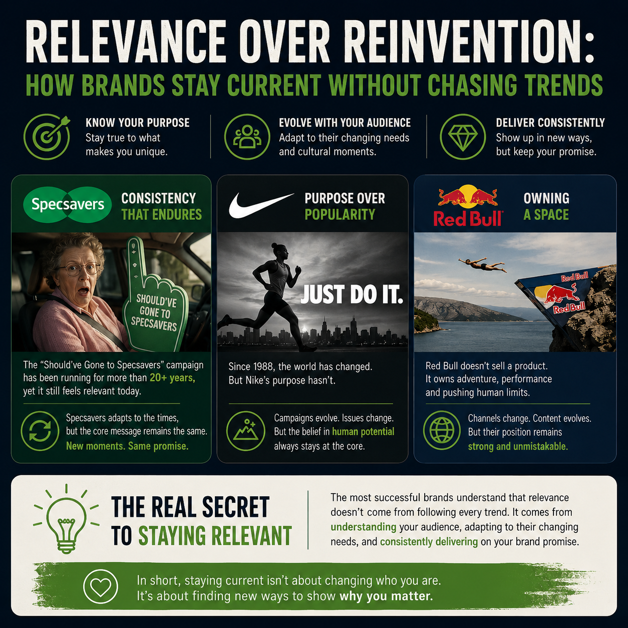
Relevance Over Reinvention: How Brands Stay Current Without Chasing Trends
 21st May 2026
Birmingham Comes Alive for Villa’s Historic Europa League Victory
 20th April 2026
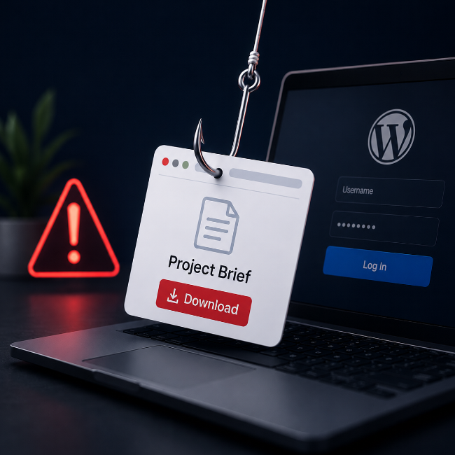
We’re Seeing a New Type of Phishing Enquiry Targeting WordPress Sites
 30th March 2026